

** I utilized a subscription dashboard scenario provided by Springboard as the foundation for this project. The highlighted sections below represent specific details from the scenario.
context
BudgetBuddy keeps track of all of your subscription fees on websites, apps, services, etc. over the years. BudgetBuddy, currently a desktop-only platform, aims to expand its reach by developing a mobile-friendly version.
This will enable a broader audience to access and utilize the budgeting tool, particularly the growing number of mobile device users. By catering to this demographic, BudgetBuddy can significantly increase its user base and drive business growth.
problem
It’s hard to keep track of all the products and services that we subscribe to each month.
The following user stories for a mobile app to support the existing website must be created:
As a current user, I want to see all of my subscriptions in one place so that I can get a comprehensive view of my spending on subscriptions.
As a returning user, I want to unsubscribe from a subscription so that I can reduce needless spending.
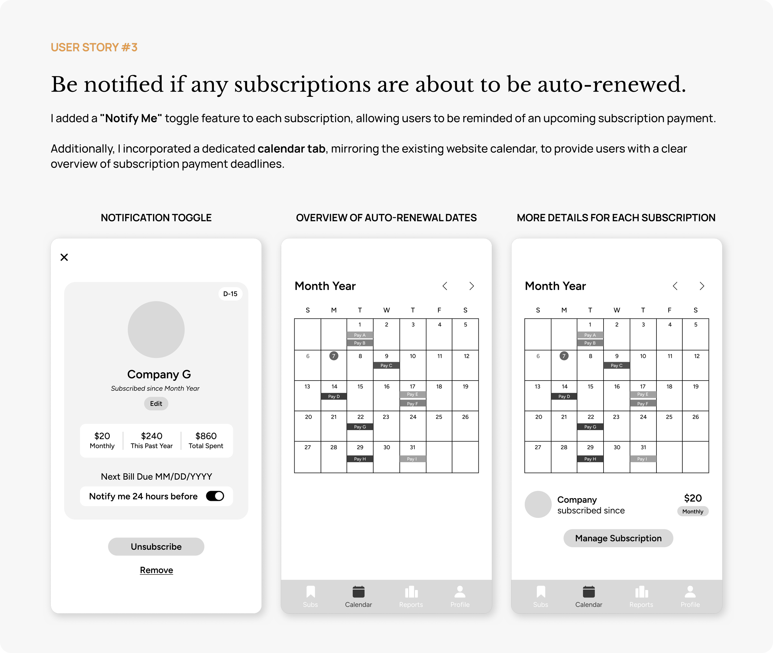
As a consumer, I want to receive notifications for upcoming subscription renewals to make informed decisions about whether to continue the service.
solution
Develop a mobile-friendly version of the existing desktop platform that aligns with the business goals outlined in the user stories.

Gain a comprehensive overview of your subscription spending.
Easily unsubscribe from unwanted subscriptions to save money.

Receive notifications for upcoming subscription renewals.
DISCOVERY
who are my users
Age: 30+
They use phone and desktop equally
Middle class
Trying to be more budget-conscious
competitive analysis
I conducted a competitive analysis of OneMain Trim (a given competitor from Springboard), Rockey Money, and Chargeback (two other popular finance apps from the Apple Store that offer subscription management features).
This analysis aimed to identify successful strategies for simplifying subscription management and assess how well these apps aligned with BudgetBuddy's business goals. By understanding the strengths and weaknesses of these competitors, I could determine key features to implement or improve in BudgetBuddy's mobile app.

PROCESS
user flow
I first created a user flow that reflected BudgetBuddy’s business goals:
see all subscriptions in one place
unsubscribe from a subscription
be notified if any subscriptions are about to be auto-renewed

sketches
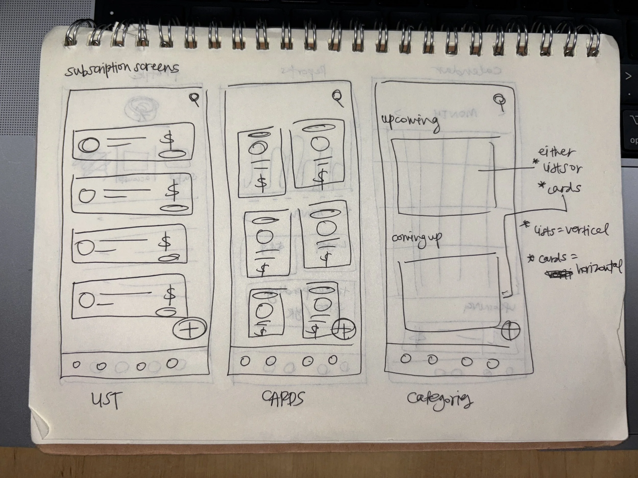
I began sketching potential screens to visualize the user flow.
The starting point was the home screen, which displays all the user's subscriptions.
I explored three layout options:
List layout
Grid layout
Category-based horizontal scrolling layout
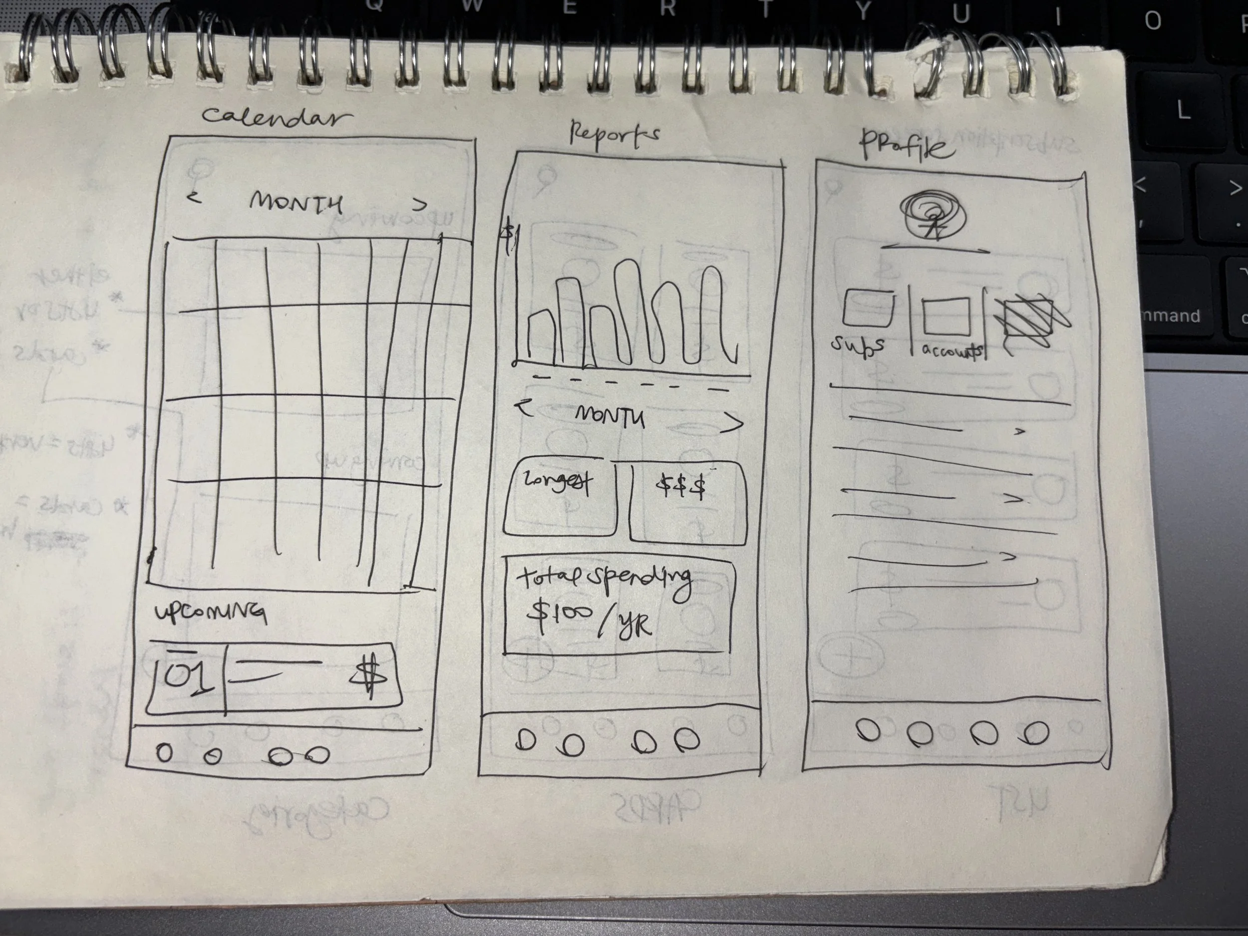
To visualize the app's functionality, I also created sketches that aligned with the existing BudgetBuddy website wireframes (displayed below).
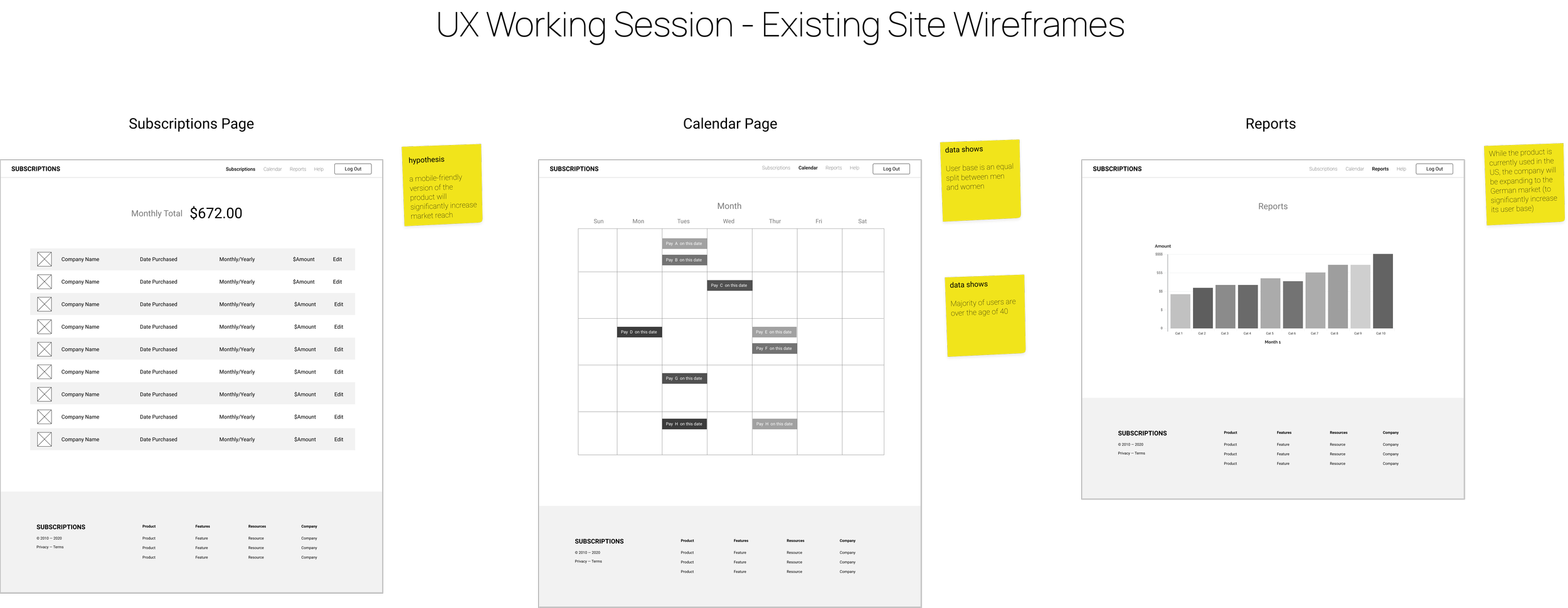
While incorporating the existing Calendar and Reports pages, I added a Profile page to centralize account settings, banking information, and FAQs.
low fidelity wireframes


UI DESIGN
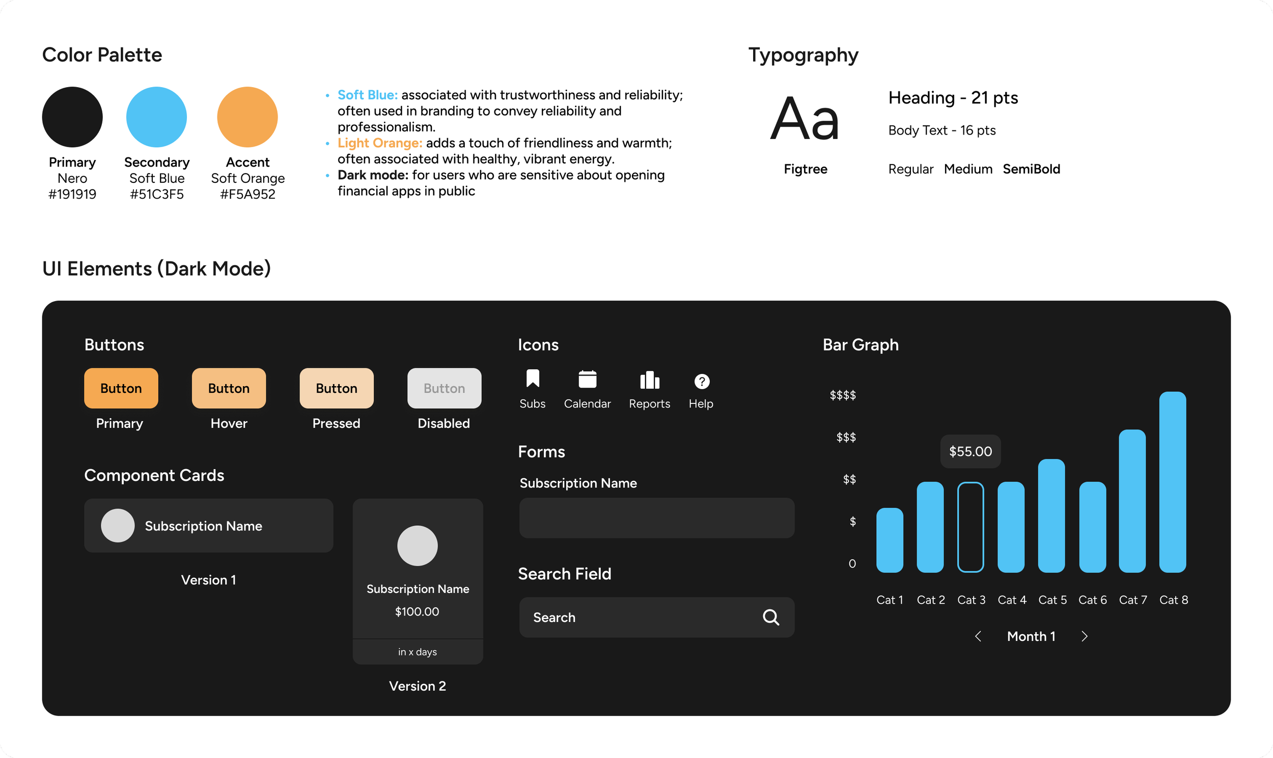
style guide
Recognizing the sensitive nature of personal finance, I designed a dark mode option to enhance user privacy when using the app in public.
usability testing insights
After applying the style guide to my low-fidelity wireframes, I conducted usability testing with five participants who were 30 years old or older and were subscribed to at least 1 subscription service to gather feedback and identify any usability issues that could be addressed in subsequent iterations.

areas for improvement
The following improvements, based on insights gathered from five participants, were implemented in the final high-fidelity designs.

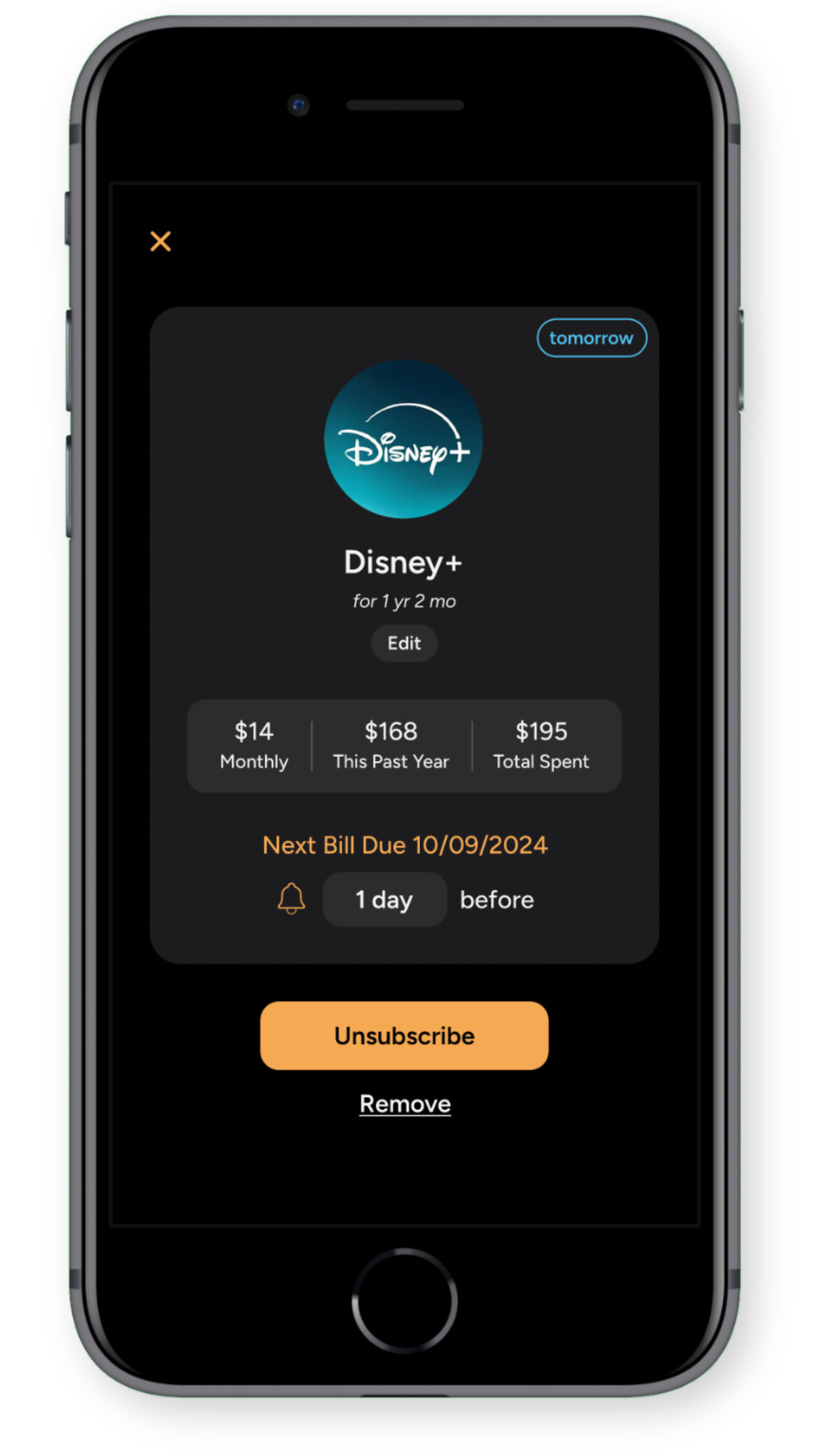
final high fidelity screens

View the full prototype here!
learnings
It was a valuable learning experience to recognize how certain UI elements, familiar to me, could be confusing to a different age demographic.
By empathizing with these users and addressing their specific needs, I was able to simplify the app's interface without compromising its functionality. This experience has honed my ability to design user-friendly interfaces that cater to diverse user groups.
next steps
Build profile tab
Swiping the card horizontally to access quick action
Organize subscriptions using a filter button / by category, price, deadline, A-Z, etc.
Reports tab: screen time / usage report to help dictate if they think it’s worth it to keep subscribing
Tutorial / onboarding wireframe
Log username and password for each subscription
An archived subscription page if the user wants to see a recently unsubscribed subscriptions and wants to be resubscribe
Make light mode
You might also want to see…
UBYou
Enhancing the usability of a student wellness app through interface reconstruction.
House2Home
Creating a solution for budget-conscious, aesthetic-driven users in their home decor selection process.