

background
House2Home is a new startup that sells home decor items and wants to make it easier for people to decorate their new homes/apartments on a budget. To validate my proposed solution, I conducted a modified GV design sprint.
problem
Users often find it challenging to select home decor items that align with their budget and desired aesthetic for their living space.
HOW MIGHT WE…
help users visualize home decor items in their own space before purchasing?
provide personalized recommendations based on users' budgets and style preferences?
THINGS TO CONSIDER
The solution should start as a website
main focus: users who want a “starter kit” of multiple products to decorate a new apartment
solution
Incorporate a “Space Simulator” feature into the website.
DAY 1: MAP
scenario notes
KEY USER PAIN POINTS
Hard to stick to a budget
Doesn't know if it will look good in their room until buying and trying it out for themselves
Spending time searching for stuff gets overwhelming/tiring
-> ends up not buying anything“What products do I buy to pull off the look/feel I want?”
Wants 3-4 products, not 10
Hard to pick out the right items
Doesn't want the room to look cheap but also doesn't want to spend a lot of money
Gets stuck trying to recreate a style the user saw on Pinterest/Instagram
USER INTERVIEW INSIGHTS
Users should shop by themes/vibes. Start with the big picture and then move to the details to reduce decision fatigue
Chelsea (user interview participant) was willing to spend $250.
-> potential starting point for budgeting featureEssentially wants an interior designer — to decorate the user’s room for them via inspirational photos, similar items, interior design tips & tricks, a room decor simulator, etc.

user flow
I created a detailed end-to-end user flow to validate the effectiveness of the "Space Simulator" feature. This flow incorporated two key elements:
Budget Setting: Allow users to establish a budget for their home decor project.
Virtual Try-On: Enable users to visualize products in their own space using the simulator.
I then filled in the gaps with additional steps necessary for a seamless user experience from start to finish.
DAY 2: SKETCH
inspiration

To gather inspiration, I conducted a thorough analysis of competitor products and related products.
crazy 8’s
Using the Crazy 8s method, I sketched various iterations of the room simulator screen, my most critical design.
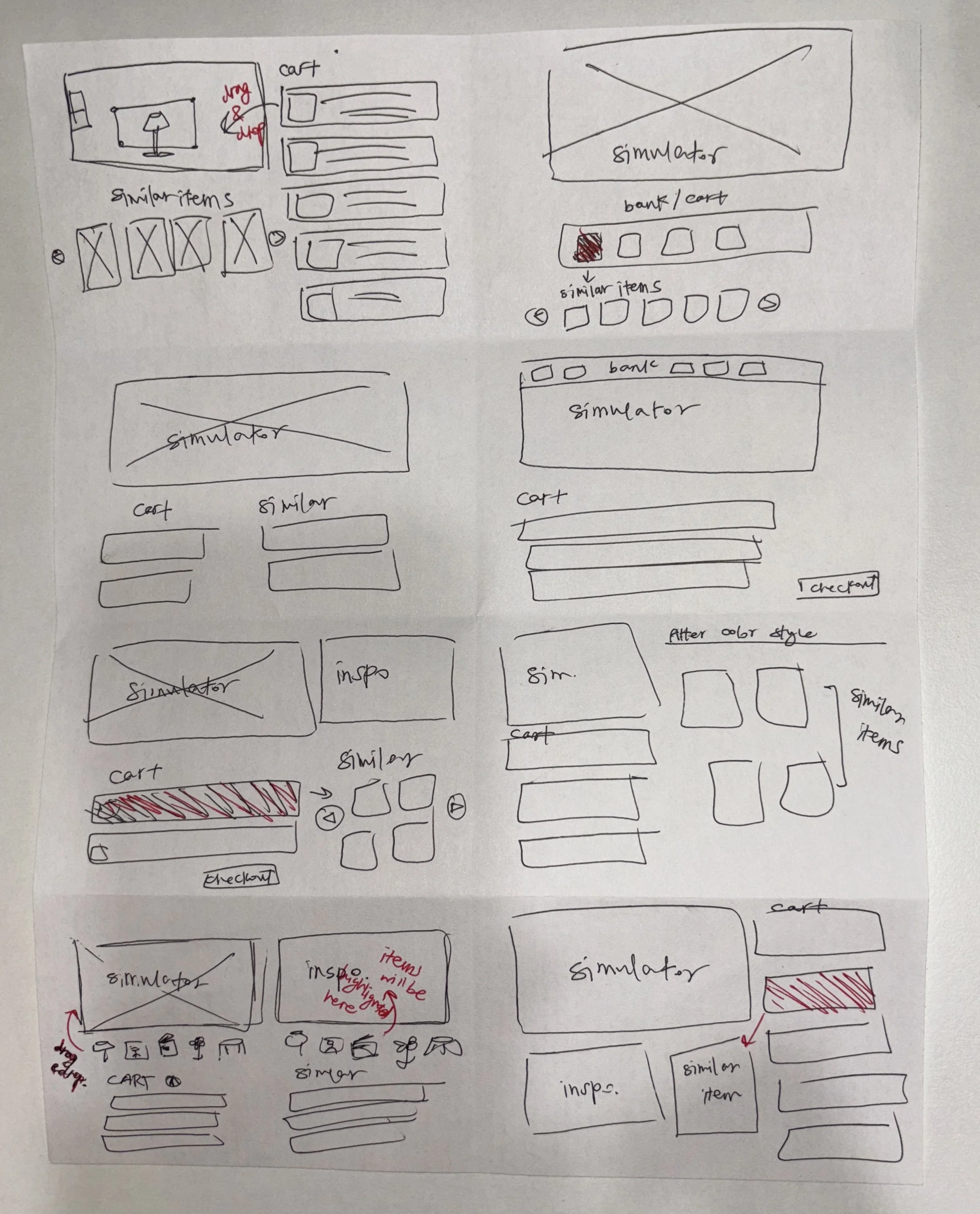
solution sketch
To visualize the user experience, I created a solution sketch outlining potential user interactions with the interface. This helped me anticipate user reactions, outcomes, and subsequent actions, providing a solid foundation for the storyboard development process scheduled for the following day.

DAY 3: DECIDE
storyboard

DAY 4: PROTOTYPE
GOAL
Evaluate the effectiveness of a room simulator in influencing user opinions about home decor products.
LEARNING OBJECTIVES
Determine if the room simulator process is too lengthy or complex.
Assess the simulator's ability to boost user confidence in their choices.
Identify any areas of confusion or gaps within the prototype

Screen 1: The landing page of House2Home

Screen 2: When the user clicks on “Simulate”, the user will be led to this welcome page where they can start the space simulator feature by pressing “Start Designing”

Screen 3: The user will choose which space (studio, bedroom, bathroom, etc.) they want to decorate and set their budget on how much they want to spend and on how many products.
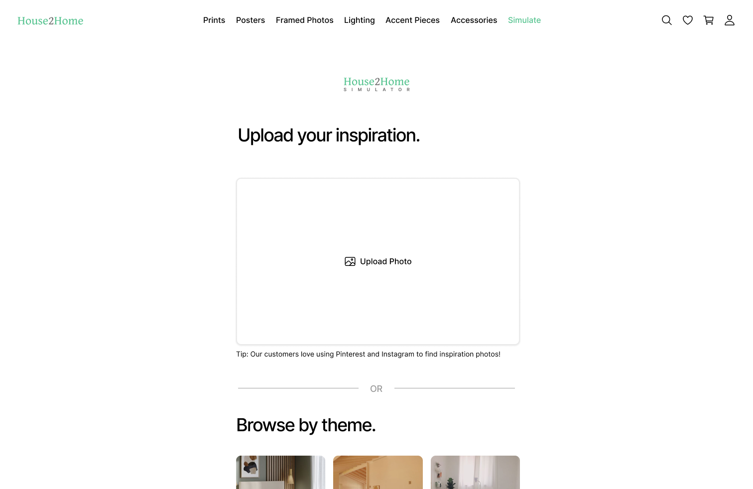
Screen 4: The user will upload their inspiration photo of how they want their space to look.
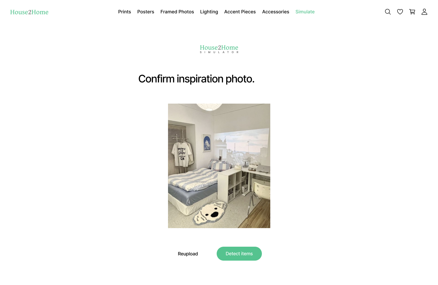
Screen 5: The user will confirm the inspiration photo and move on to the next step – detecting items in the photo – or reupload their photo.
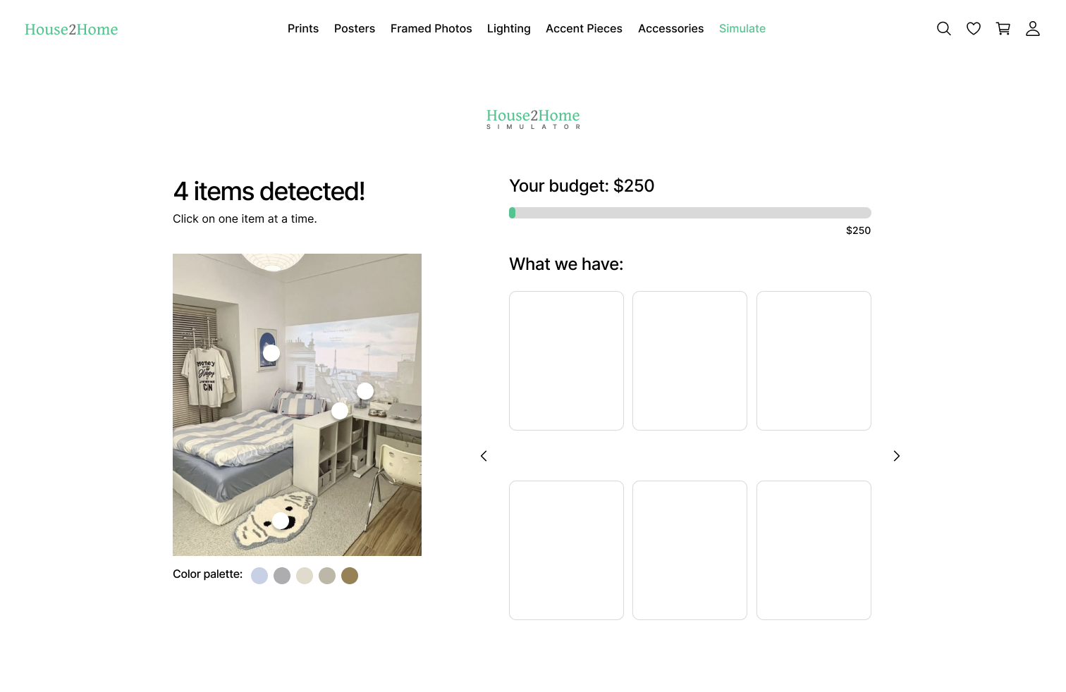
Screen 6: After the service detects the items, the user can choose similar products that House2Home provides one at a time. The service will also curate a unique color palette which will help with finding products that best fit the user’s needs.
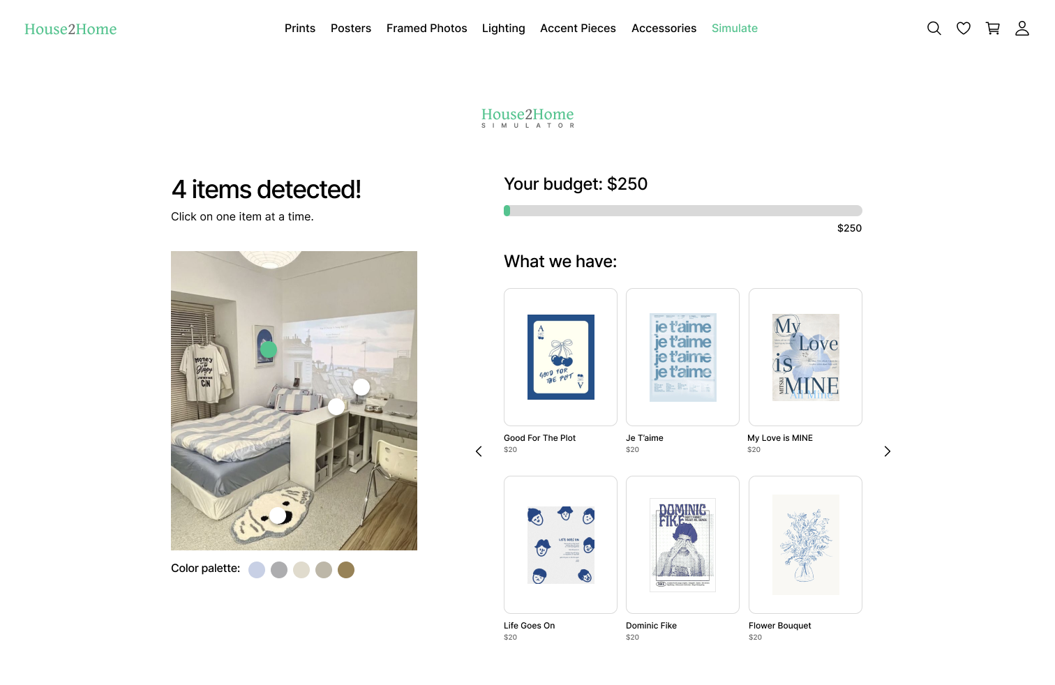
Screen 7: An example of browsing for a poster that is similar to the inspiration photo.
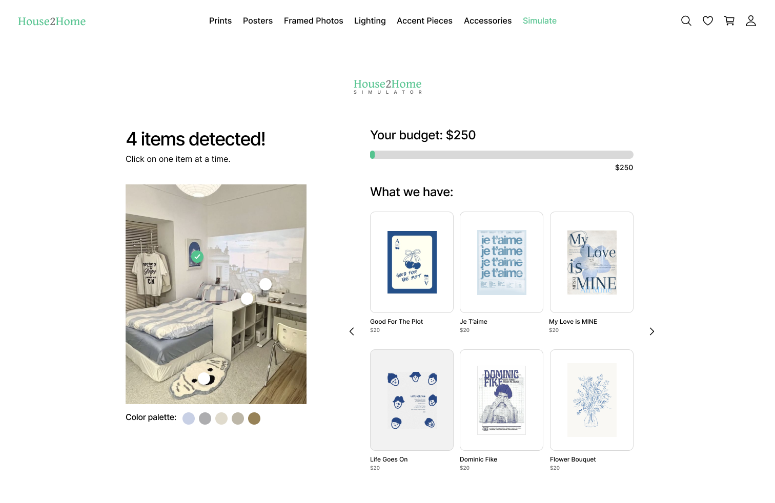
Screen 8: The user selected the “Life Goes On” poster and will repeat screens 7 and 8 for the remaining 3 items that have been detected in the photo.
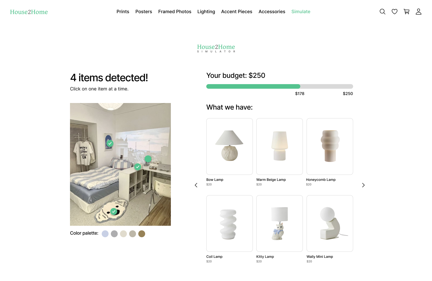
Screen 9: The user is browsing through the lamps that are similar to the inspiration photo.

Screen 10: The user selected the “Kitty Lamp”. After selecting all 4 items, this becomes the user’s “Starter Kit”.
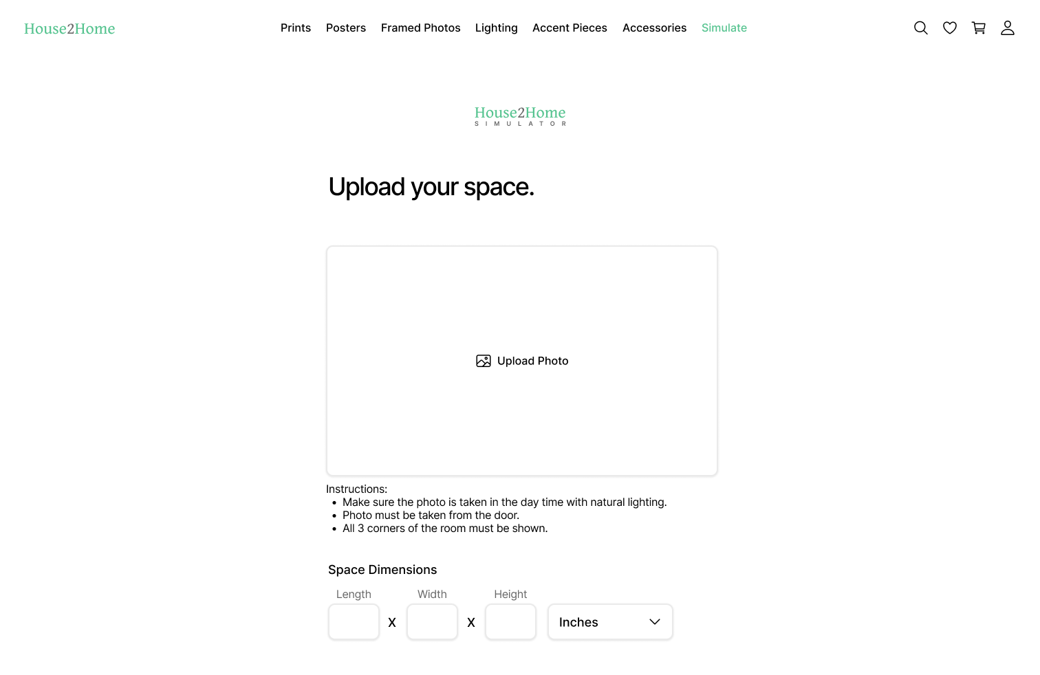
Screen 11: The user will upload a photo of the space they want to decorate with measurements of their space for accuracy.

Screen 12: The user will either confirm the photo or re-upload it.
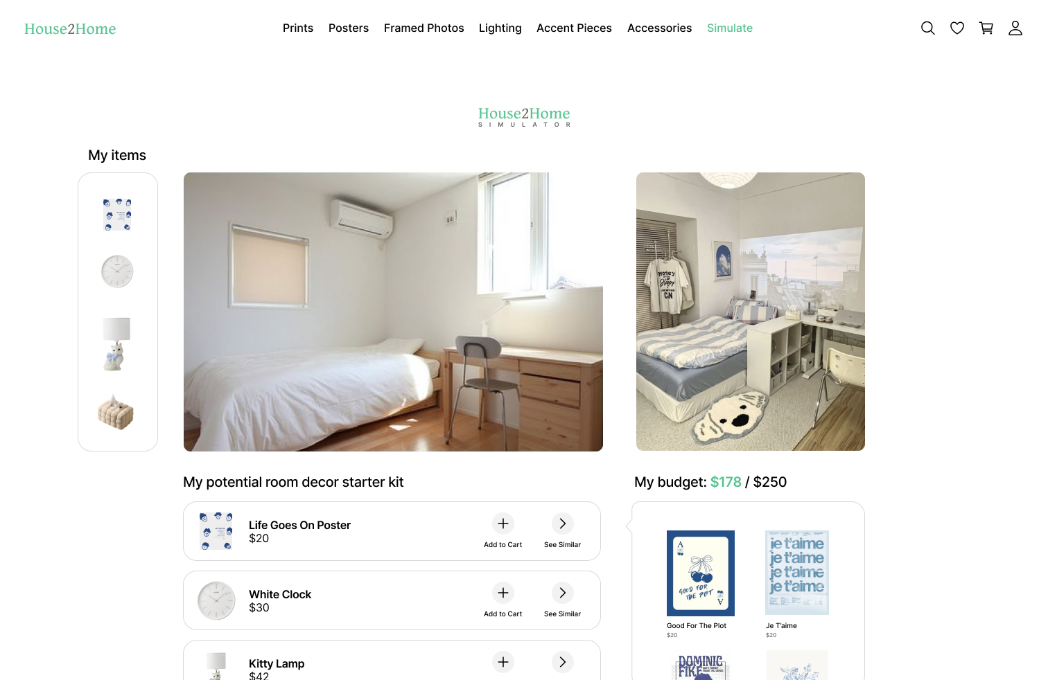
Screen 13: This screen allows users to visualize how their selected products will look in their room. Selected items can be dragged and dropped into the space simulator, and a detailed list of items is provided below for easy reference. Users can add items to their cart or choose alternatives based on the simulated space. The initial inspiration photo is displayed alongside the simulator for comparison.
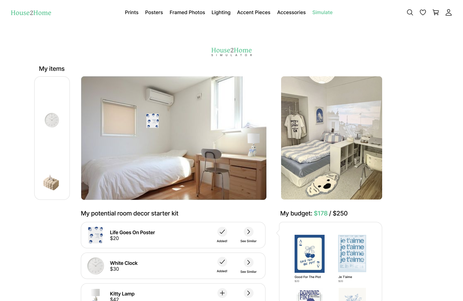
Screen 14: The user has placed the poster and lamp in the space simulator to experiment. The user also added the poster and clock to their cart.

Screen 15: After placing all items in their cart, the user pressed on their cart to purchase these items.
DAY 5: TEST
interview script
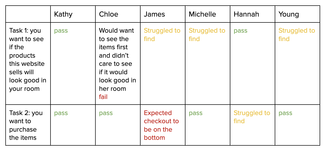
I conducted usability testings with six home décor enthusiasts using the Five-Act Interview technique to test my prototype.
Act 1: welcome → small talk → ask for permission to record
Act 2: open-ended “personal” context questions
When was the last time you shopped for something to decorate your place?
Any struggles when shopping?
Act 3: look at the prototypes
Act 4: give specific tasks
Task 1: You want to see if the products on this website will look good in your room. How would you do that?
Task 2: How would you make your purchase?
Act 5: debrief to find their overarching thoughts & impressions


To expedite the recruitment process, I reached out to family and friends for interview participation. This personal connection facilitated a comfortable and relaxed interview environment.
testing insights
Usability testing revealed that while 4 out of 6 participants successfully completed the checkout process, only 2 out of 6 could locate the room simulation feature.
Interviewing the users allowed me to discover that users would primarily visit House2Home to browse products rather than visualize them in their space. This insight likely explains why participants in usability testing struggled to find the simulation feature. Therefore, I decided to reposition the simulation feature as a secondary option.
areas for improvement
Based on the insights from the usability testing, I identified several areas for improvement and addressed these issues accordingly:
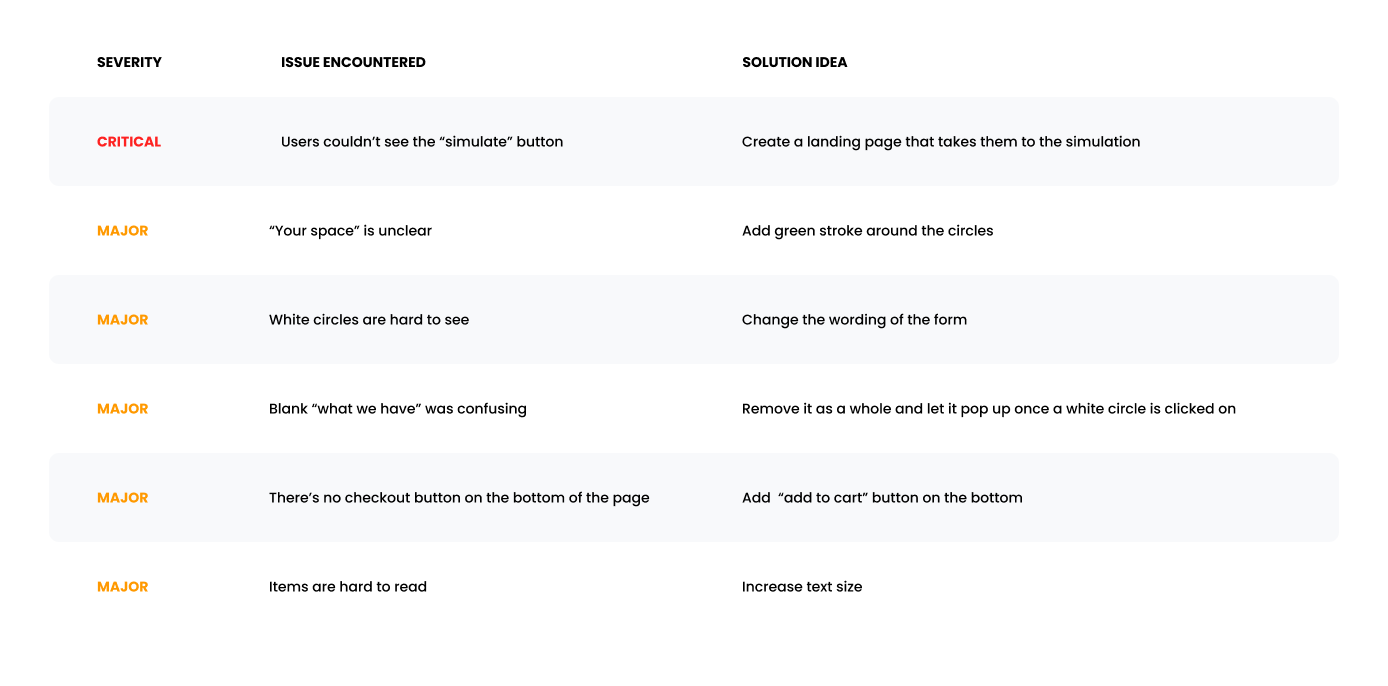
iteration highlights
1. Users couldn’t see the “simulate” button.

2. “Your space” is unclear.


3. White circles are hard to see.
View the prototype here!
learnings
This project helped me gain proficiency in conducting design sprints and utilizing tools like Crazy 8s and solution sketching.
I discovered the effectiveness of storyboards for empathizing with users and visualizing their journey from beginning to end, which helped me gain a deeper understanding of the user experience.
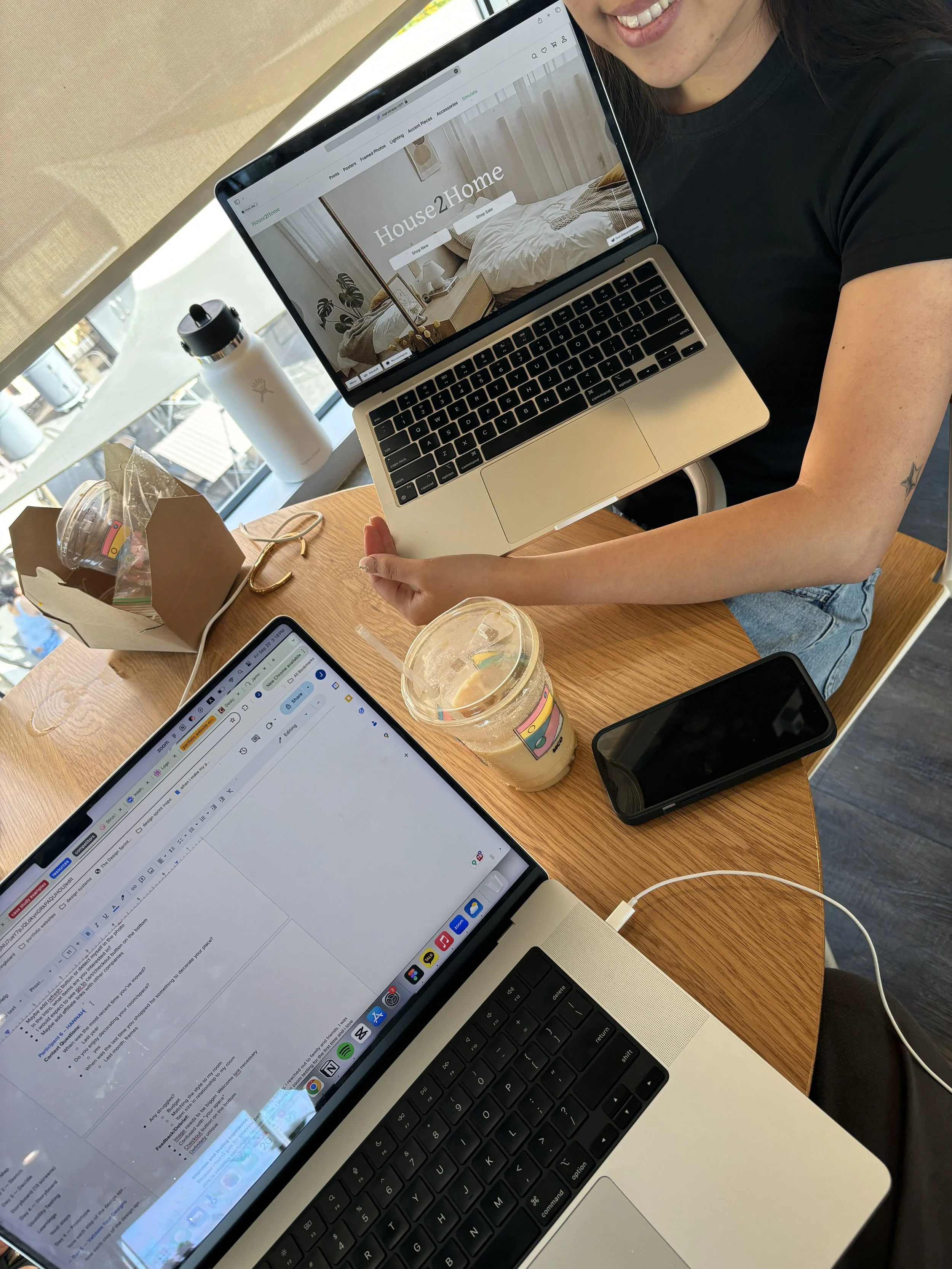
I experimented with Zoom testing for the first time, finding it highly beneficial to observe participants' actions as they shared their screens.
Lastly, my first experience creating a website prototype allowed me to understand the nuances of designing for desktop versus mobile platforms.
next steps
Create a mobile version of the website
Work on minor issues from usability testing
Update “Starter Kit” collections based on items being detected through the simulator feature
After collecting enough data from users trying out the simulator feature, this can be its own design sprint project.
You might also want to see…

Fulfilled
An app that helps busy individuals achieve a healthier work-life balance.

Budget Buddy
A mobile expansion of a subscription management service to drive business growth.