

context
UBYou supports college students' well-being and academic success by providing a central hub for mental health resources, wellness tools, and easy access to campus support services.
Collaborating with UBYou's founder, Jack, my team of two other UX/UI designers and I worked to enhance the app and create a more seamless user experience to drive user engagement.
problem
UBYou users have expressed that the interface feels blocky, inconsistent, and overwhelming.
While Jack prioritized a UI redesign, our UX audit revealed a key pain point: information and resource overload, which could overwhelm users seeking assistance via the app.


solution
Reconstruct the interface to improve the functionality of the app.

Home page design
Replace the hub layout with a more streamlined design to prevent users from feeling overwhelmed by reducing the number of options on the home screen.

Optimized Wellness Check-In Experience
Redesign the wellness check-in user flow to better address user needs and avoid presenting them with an overwhelming list of resources.
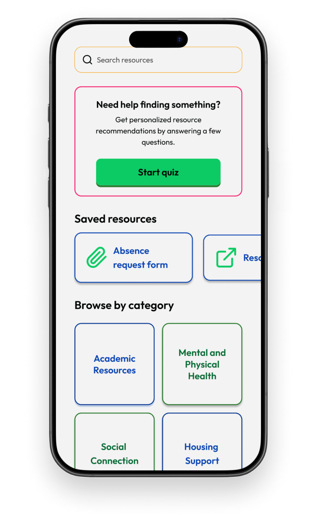
Overall visual aesthetic
Update the UI design for consistency throughout the app while staying aligned with the brand voice and values.
RESEARCH
We began by individually analyzing the app and conducting a UX audit to gather insights and identify areas for improvement.
sitemap
Because all resources stemmed from the main hub, the app’s original sitemap had a wide horizontal structure, indicating a potential navigation issue.

REVISED SITE MAP
To address navigation challenges, we implemented a navigation bar providing access to the four core components of the app:
Wellness Check-in
Campus Resources
UBYou Resources
Account
This decision was informed by app exploration and discussions with founder Jack, and subsequently reflected in an updated sitemap.

competitive analysis
To understand how similar apps create engaging and navigable user experiences and inform our design decisions, we also conducted a competitive analysis of six apps:


PROCESS
user journey
Because this app functions as a resource hub, we recognized that users might have varying motivations for using it. To better understand these diverse needs, we created user journey maps for three distinct scenarios:
A user who…
utilizes the wellness check-in to process and record their emotions
seeks resources to address negative emotions
accesses campus resources
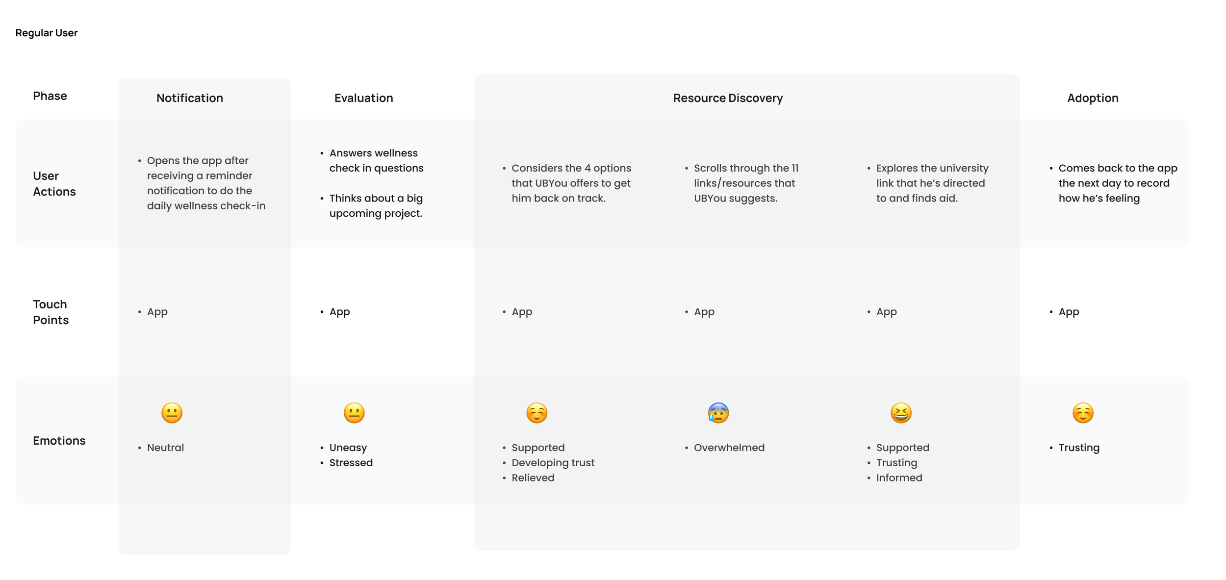
Joy's user journey: uses wellness check-in to process emotions

Morgan's user journey: seeks resources to address negative emotions

Wendy's user jouney: needs academic support
crazy 8’s
To kick off the redesign, we prioritized the home screen, wellness check-in, and campus resources screens, informed by our updated sitemap. In an eight-minute sketching session, we each explored one of these areas before coming together to review and select the strongest, most user-friendly ideas.

JOY

MORGAN
WENDY
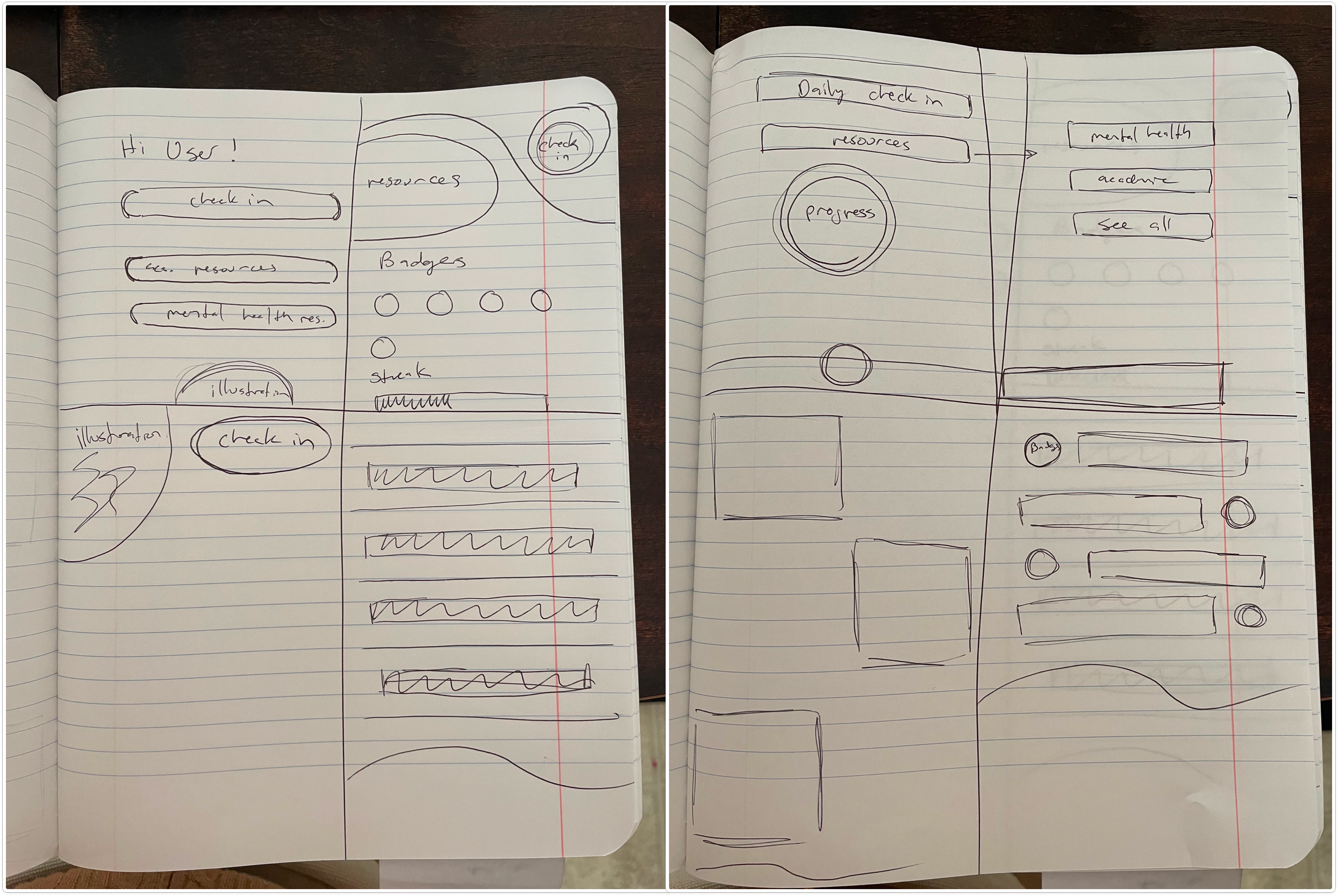
low fidelity wireframes
Building on our initial sketches, we discussed the strengths of each concept and translated them into low-fidelity wireframes. After presenting these to Jack and gathering his feedback, we selected the two most promising screens, shown below.

The original wellness check-in used inconsistent question layouts. We addressed this by implementing a standardized, quiz-style vertical list format, believing this approach would resonate with our target audience of college students.

UI DESIGN
user journey
We updated the style guide while retaining key elements requested by Jack, the founder. He emphasized the following:
Brand Identity: The overall tone should convey high energy, excitement, and growth, similar to college athletics programs.
Color Palette and Mood: The app's color palette should be inclusive of all college students, regardless of grade level, age, or gender, while acknowledging that the majority of the target audience is between 18 and 22 years old.
Existing Logo Colors: The current logo uses #3ac948 (green) and #0047ba (blue). Jack expressed openness to exploring different shades of these colors.
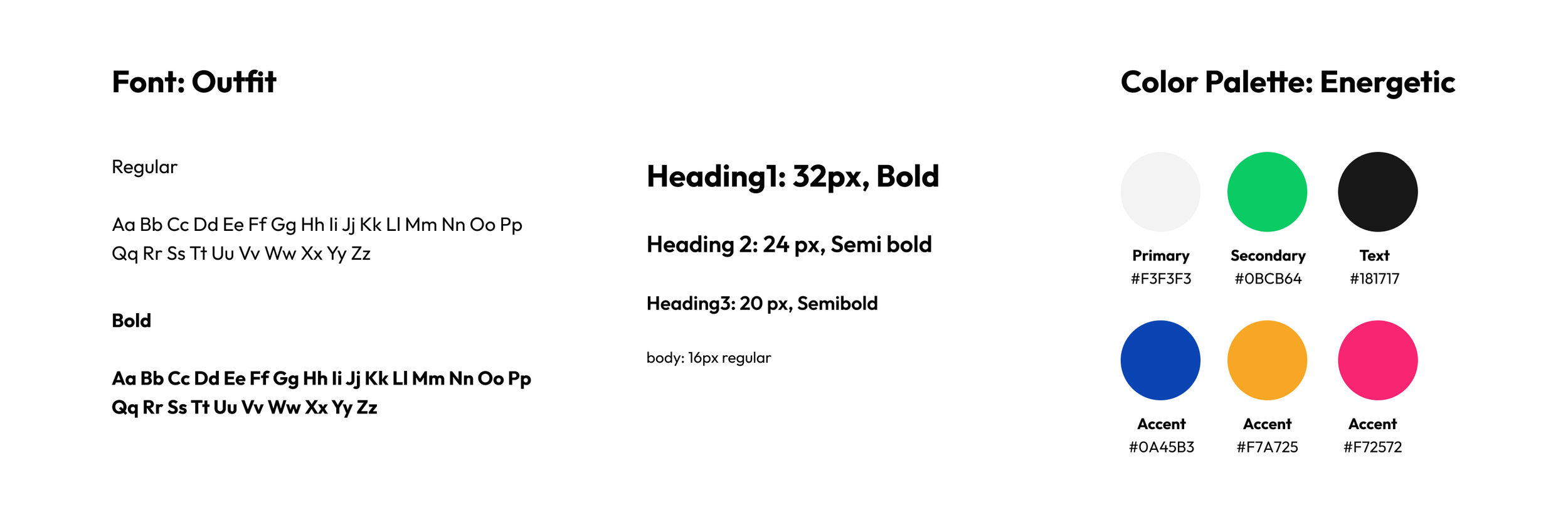
The primary update was revising the green and blue color values to achieve sufficient contrast ratios and meet accessibility guidelines.
final screen designs

learnings
As my first collaborative project, I learned the crucial role of effective communication with both teammates and clients. There were instances where design decisions were driven by personal preference, and I learned to effectively advocate for user-centered rationale to either validate or redirect those choices.
I also discovered the importance of focused development; while the founder initially wanted to incorporate numerous features, we collaboratively prioritized key functionalities to create a more impactful and niche product. Lastly, referencing our initial goals proved essential for staying on track and avoiding scope creep.
next steps
Apply UI design to “UBYou Resources” tab and “Profile” tab
Create a flow for Campus Resource quiz
Gamify the app to increase app usage
Partner with other colleges that care about student wellness and success
You might also want to see…

Budget Buddy
A mobile expansion of a subscription management service to drive business growth.

Fulfilled
An app that helps busy individuals achieve a healthier work-life balance.